


Finding practical colors
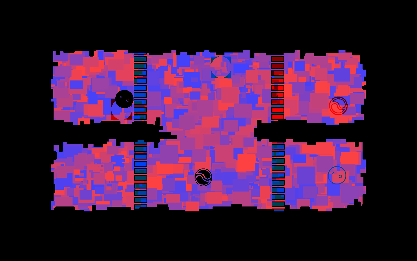
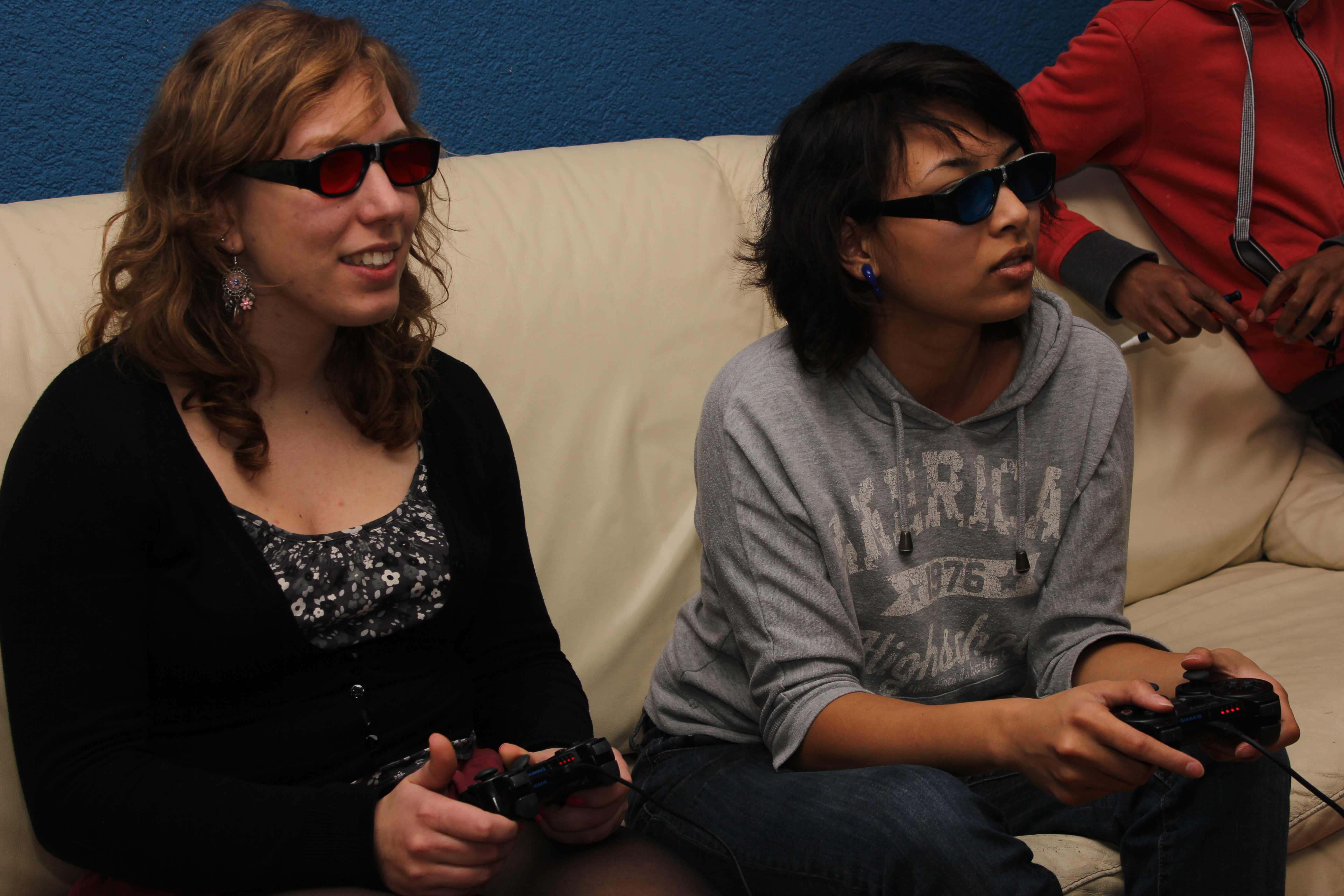
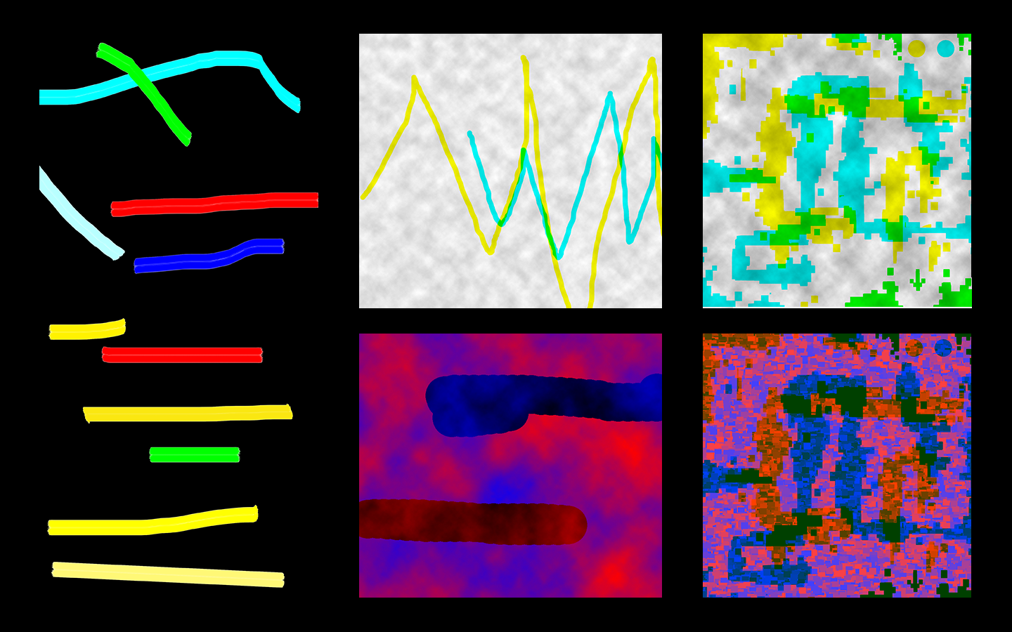
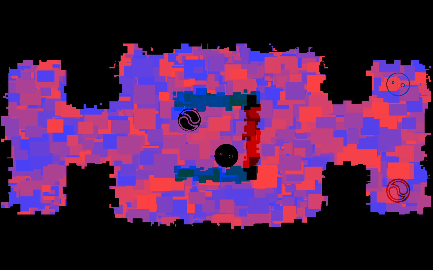
Bichromia started with a lot of extensive color studies. The idea of showing each player a different version of the same image could only work if we could really filter out colors using simple plastic glasses. If a player could still slightly see the colors of the other player, the whole concept wouldn’t work. Therefore we did a lot of of iterations on the color scheme during the Global Game Jam weekend. In the end we went for these red/blue colors. The blocky visuals are mostly a practical choice, since it filters out the colors even better when wearing the glasses.
Designing challenges
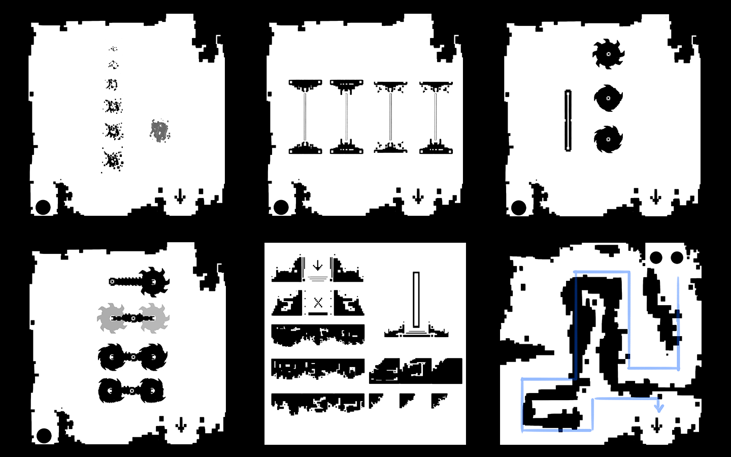
When the colors were picked and Hans was working on the shader to make it all work, I took the time to design some levels for the game. First on paper, later digitally. Here you can see some of the levels. These include early ideas to show each player a slightly different message (1), safe places to hide from lasers (3) and moving lasers (4). Only sketches 2 and 5 ended up in the game. At the end of the Global Game Jam weekend alone, we had over 20 level ideas. When we decided to take another weekend to actually build them, what levels should we pick?
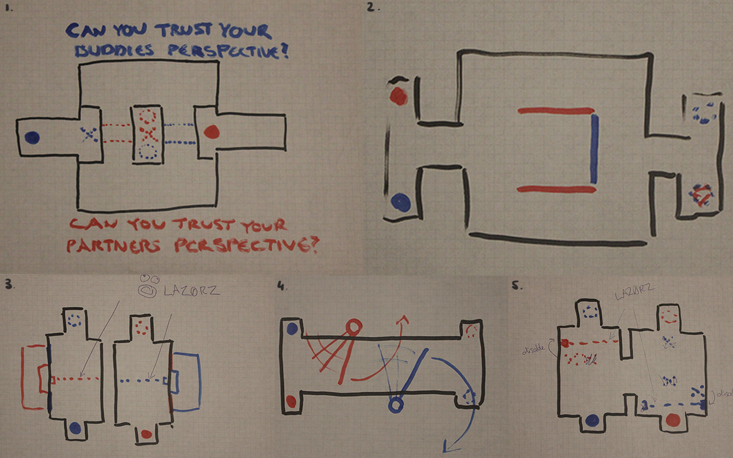
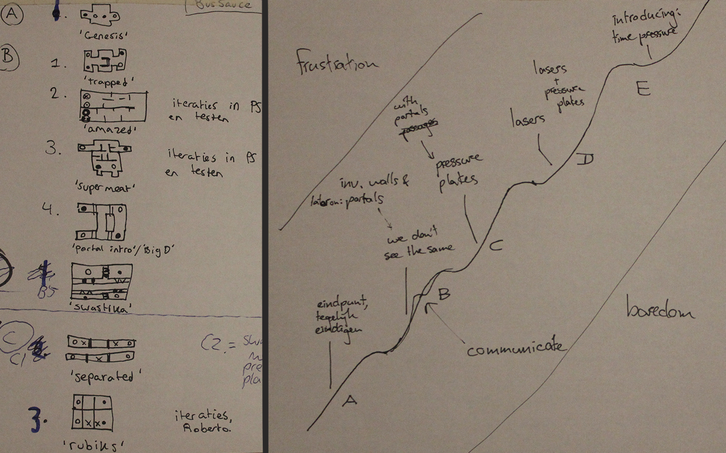
Picking the right levels
We used the progression curve that you see on the side. At every letter, a new challenge is introduced to the player (A = just walls. B = add portals. C = add pressure plates. D = add lasers. E = add time pressure). The main idea was to provide challenges for the players that could only be passed by letting the players communicate. So it was essential to learn the players to communicate early in the game. I noticed by (paper) prototyping and early playtesting that walls alone were not enough, so portals should be introduced early in the game (B challenges start at level 2, as can be seen on the left). Playtesting really helped to determine the right order.
Doodles come to life
Another task of mine was to work on the icon designs. Due to the way the Bichromia shader works, I was limited to two colors and simple shapes. Here are some early character doodles. I made them on paper and hung them on the wall so my team mates could walk by and put a check next to their favorite icon. The ones with the most checks went through my iteration process and finally made it into the game. Below are some digital portal sketches and the result how everything looks in a level.
All contributors
Design: Hans Cronau, Daniël Wewerinke, Esmeralda Massaut and Remon Helmes
Art: Daniël Wewerinke and Esmeralda Massaut
Programming: Hans Cronau, Remon Helmes and Roberto Gemin.
Audio: Max Klostermann
Created (partially) during the Global Game Jam 2014.